

American Hearing and Research Foundation
Style Guide
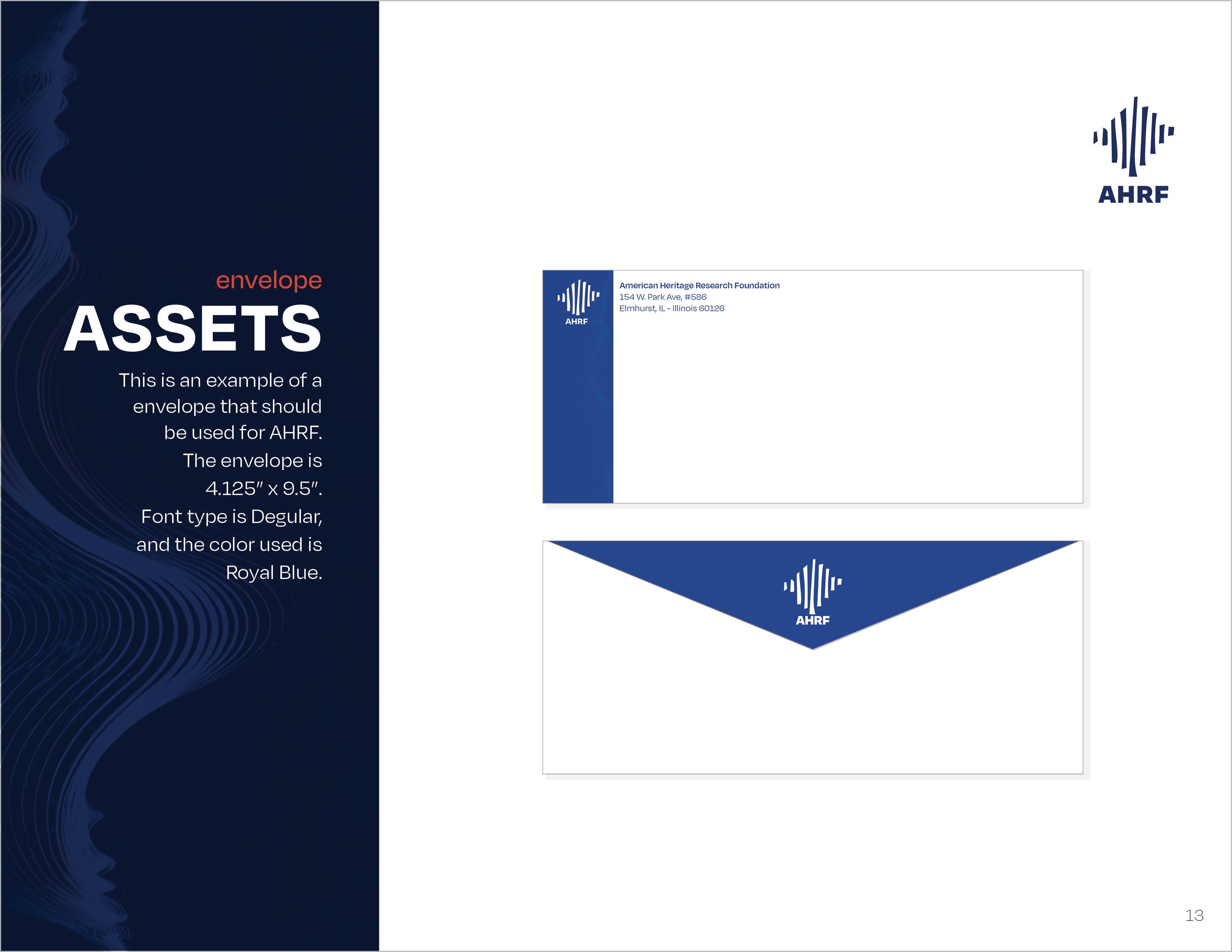
The Final Style Guide
In my design class, we were given the task of finding a non-profit that we thought needed a little update to their website by developing a Style Guide for that organization. I chose the American Hearing Research Foundation, for the cover of the Style Guide I used a sound wave for the background effect. I created a stylized, hand-drawn version of a sound wave for the logo in the bottom corner. All the content I developed for the brand is laid out page by page. It includes the logo, color scheme, layout rules, do’s and don’ts, assets, images, and advertising ideas. At the very bottom I also provide examples of my Mood Boards and sketches, which helped inform the design.


Mood Boards
Before starting the project, I brainstormed with Mood Boards to find the right color scheme, tone, mood, and fonts for my design. I wanted something with a reassuring and stable mood.


Thumbnails and Sketches
After I decided on a color scheme and font for the brand, I needed to create a logo for the product. I proceeded to sketch out ideas for the layout of the guide itself and used a grid system to create each page so that there would be a polished, harmonized final product.


